Sunday, November 1, 2009
Unemployment vs. GDP Growth
It's slow and lagging. Don't buy in to the conservative line that the Obama administration is not performing on jobs.
Monday, October 12, 2009
Tuesday, June 16, 2009
Our Failed Economic Model

These are telling charts, from the Congressional Budget Office, showing the increasing disparity of income and wealth distribution over the last three decades. The time series above is the most telling of the bunch. Is there any question about what has been wrong with the economy? We are turning into a banana republic. Has there ever been a clearer picture that "top-down" economic theories don't work for those who are not at the top?
Thursday, June 4, 2009
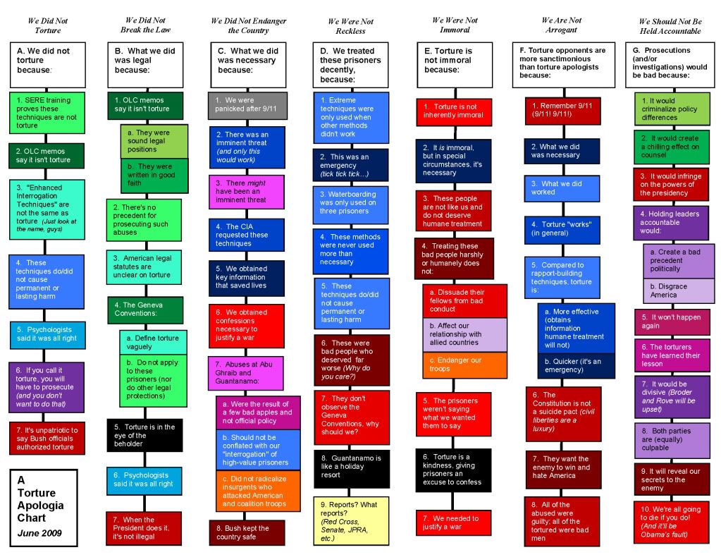
Collecting All the Arguments for Torture
Here is the link and following is the chart. Is anybody impressed with any of these arguments? Of course the fact that torture is ILLEGAL is determinative!
Tuesday, May 19, 2009
Charitable Giving

This chart is frankly shocking. And this result is before the cut in charitable giving write-offs for those above $250k. I guess they weren't so generous in the first place.
Saturday, April 18, 2009
More Data Comparing Economic Performance


Some "eye-popping" charts comparing economic performance of Republican vs. Democratic regimes. Tell me again why the Republican Party is the party of economic growth and success? There are more references at this site. The conclusions don't change no matter how you look at it.
Putting the Absurd Tea Parties in Perspective


No matter how you look at it, the tax rates in the US are not high on a global scale. We can always bitch about taxes, but they are not out of line, especially when you consider that we have by far the largest expenditures on defense, over 20% of the federal budget. By the way, this stuff comes from Forbes, hardly a bunch of raving progressives.
More on Growing Income Inequality


I fail to see how this is "fair". The usual argument for rewarding the rich is that they are the ones who create wealth with all their drive and creativity. If they aren't rewarded they will testily sit on their asses, screwing us all (per Ayn Rand). Well, they have been getting more and more for 30 years. Where are the great results? Not so much. A failed experiment. We're turning into a banana republic with no bananas.
Wednesday, April 15, 2009
Federal Government Expenditures: Waste
 Of the three biggest chunks of spending, we know that both Defense (still fighting the cold War) and health care (higher delivery cost than any where on earth) are loaded with waste. I conclude that by being smart, probably an impossibility, we could take care of the pension and health needs of our "advanced" civilization without significantly higher taxation. It will take years of chipping away at the mix strategically. By the way, aren't education and research ridiculously low given our bleak future in energy and the environment?
Out-of-Control Spending by Dems -- Not!

 I've covered this before, but it is another classic example of rampant Rovism: acuse the Dems of what you yourself are doing worse. In this case, much worse. This data should stop any righty during a rant on out-of-control spending by Dems -- but it won't because facts don't matter.
Tuesday, April 14, 2009
The Tax "Crisis"

The latest Gallup poll measures whether American consider their taxes too high. Surprisingly, the number saying yes has fallen from historical levels. Let's have a tea party!
Monday, April 13, 2009
Older Workers Frozen Out
It is a fact that older workers are at a competitive disadvantage versus younger workers for any given open position. This article gathers responses from a "panel of experts" as to why that is so. A lot of the ideas seem ridiculous (tougher to manage?), but the ones that strike me most forcefully are: the expectation in the future of decreasing productivity of an older worker vs increasing for a younger, and (perceived) higher health care costs.
Wednesday, April 8, 2009
The Myth of 60% Required in the Senate

Norm Ornstein points out in this essay that obstructionist use of the filibuster in the senate has gotten out of control. Don't believe the malarkey that the senate has always operated this way. Not true as clearly shown above.
Tuesday, April 7, 2009
Comparing Stock Market Crashes

Krugman referenced this paper which compares the tracks of various economic indicators of the current "recession" to those same measures of the Great Depression on a world-wide basis. The above chart of the index of stock market performance by month after the peak is not so hot, as we all already know. Overall, we are in deep stuff. Check out the other charts at the link.
Sunday, April 5, 2009
Catholics: Not So Conservative

This recent Gallup poll shows that Catholics, claimed by many on the right to be in alignment with the social agenda of the Republican Party, reflect the viewpoints more closely of the average American, which in turn are more liberal than the corporate press or repub politicians would have you believe. Stubborn facts strike again.

Wednesday, March 25, 2009
No Housing Bubble in Detroit

This chart shows that the housing bubble is certainly bad nationally, but it never even existed in Detroit. Oy.


Saturday, March 21, 2009
Income Inequality
A primary driver of the economic situation today in the US is increasing income inequality. See this:


 Even the Wall Street Journal acknowledges the facts, including this chart:
![[Unequal]](http://s.wsj.net/public/resources/images/NA-AO215_Unequa_20071011182042.gif)
During this same period, it is hard to argue that the increasing inequality has fueled an overall higher GNP growth rate:
![[FedGDP.JPG]](https://blogger.googleusercontent.com/img/b/R29vZ2xl/AVvXsEhsyrCaAlMRQHidgI3dyNAEXybN5H09mjzH0N-fIkTapwMJP0Z5-g9VZ4_rmkq1rsN4NhbvgtgqAqZztfQ0mhzFZM35IHNl8F2GE7MWFRNKz9Hyqxfo-oKqiuRLsguDUH3hFH-wpMp-xq8x/s1600/FedGDP.JPG)

United_States_Income_Distribution_1967-2003.svg (SVG file, nominally 1,000 × 400 pixels, file size: 14 KB)
Another way of looking at it is from Krugman:
This is for households so a significant making feature is the increasing numer of women in the work force over the same period. Another way of looking at the data, adding the top 1% group:
 Even the Wall Street Journal acknowledges the facts, including this chart:
 During this same period, it is hard to argue that the increasing inequality has fueled an overall higher GNP growth rate:
Restarting
I have taken a hiatus from blogging since the election. Also, some personal issues have absorbed my time recently. However, I am restarting this blog with a new emphasis: posting data and charts that clearly explain and analyze the greater economic, social, and political issues we all face. Too often the issues, analyses, and prescriptions put forward by our political leaders and, even more discouragingly, by our "independent" national press, are incorrect, misleading, or diversionary. When I see a chart or data-based analysis that clarifies or illuminates a supposedly debatable point, I will post it so that over time, this blog will become a repository of solid data to counter much of the pervasive blather and bullshit. By using the Labels feature, it will be easy to collect the key data by subject, such as Health Care.
Let's see how this goes over time. There will be some backing and filling for a while as I reconnect with information I have noted over recent months.
Let's see how this goes over time. There will be some backing and filling for a while as I reconnect with information I have noted over recent months.
Subscribe to:
Posts (Atom)